2006 Dodge Challenger Concept
|
Price |
-- |
Production |
-- | ||
|
Engine |
6.1 liter Hemi V8 |
Weight |
-- | ||
|
Aspiration |
natural |
Torque |
420 lb-ft @ 4800 rpm | ||
|
HP |
425 @ 6000 rpm |
HP/Weight |
-- | ||
|
HP/Liter |
69.7 hp per liter |
1/4 mile |
13 seconds | ||
|
0-60 mph |
4.5 seconds |
Top Speed |
-- |
(from
DaimlerChrysler Press Release) In
creating the new Dodge Challenger concept car the designers at
Chrysler Group’s West Coast Pacifica Studio knew they had a rich
heritage to draw upon.
They also knew they had an obligation to “get it right.”
Tasked with the enviable assignment of developing a hot-looking
performance coupe using Chrysler Group’s advanced rear-wheel drive
LX platform and its fabled HEMI® engine, the designers explored a
variety of options, eventually gravitating to “something” for the
Dodge brand — appropriate given that brand’s bold performance image.
The idea of reinventing the highly-collectible Challenger quickly
came to mind.
Eager to begin, the designers drew up a “short list “of the
essential attributes of a muscle car: distinctly American; mega
horsepower; pure, minimal, signature lines; aggressive air-grabbing
grille; and bold colors and graphics.
“Challenger draws upon the initial 1970 model as the icon of the
series,” said Tom Tremont, Vice President – Advanced Vehicle Design.
“The 1970 model is the most sought after by collectors. But instead
of merely recreating that car, the designers endeavored to build a
Challenger most people see in their mind’s eye — a vehicle without
the imperfections like the old car’s tucked-under wheels, long front
overhang and imperfect fits. As with all pleasurable memories, you
remember the good and screen out the bad.
“We wanted the concept car to evoke all those sweet memories …
everything you thought the Challenger was, and more.”
“During the development of the concept car,” says Micheal
Castiglione, principal exterior designer, “we brought an actual 1970
Challenger into the studio. For me, that car symbolizes the most
passionate era of automotive design.”
Being key to the image, getting the right proportions was critical.
The Challenger concept sits on a 116-inch wheelbase, six inches
longer than the original. But its width is two inches greater,
giving the concept car a squat, tougher, more purposeful persona.
The signature side view accent line — designers call it the “thrust”
line — is higher up on the body, running horizontal through the
fender and door and kicking up just forward of the rear wheel.
In section the upper and lower body surfaces intersect and fall away
along this line, which has just a whisper of the original car’s
coved surfacing.
“We wanted to stay pure,” said Castiglione, “with simple, minimal
line work, but with everything just right.”
The five-spoke chrome wheels — 20-inch, front; 21-inch, rear — are
set flush with the bodyside, giving the car the powerful muscular
stance of a prizefighter eager to challenge the world. Wheel
openings are drawn tightly against the tires, with the rearward
edges trailing off. To emphasize the iconic muscularity, the
designers added plan view “hip” to the rear quarters.
One of the key characteristics of the original car the designers
wanted to retain was the exceptionally wide look of both the front
and back ends. To achieve this the designers increased both the
front and rear tracks to 64 and 65 inches respectively, wider than
the LX, wider even than the 1970 model. To realize the long
horizontal hood the designers deemed essential, the front overhang
was also increased.
Both the hood and the deck lid of the Challenger concept vehicle are
higher than the 1970 in order to lift and “present” the front and
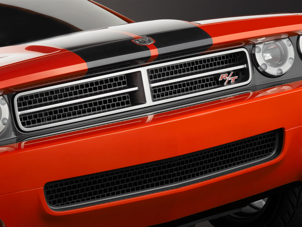
rear themes. The front end features the signature Dodge crossbar
grille and four headlamps deeply recessed into the iconic car-wide
horizontal cavity. Diagonally staggered in plan view, the outboard
lamps are set forward, the “six-shooter” inboard lamps slightly
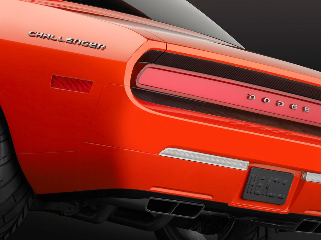
rearward. At the rear, the car-wide cavity motif is repeated,
encompassing a full-width neon-lit taillamp. Both the grille and the
front and rear lamps are set into carbon-fiber surrounds. Like the
original, slim rectangular side marker lamps define the ends of the
car.
Bumpers are clean (no guards), body-color and flush with the body.
“This is something we would have loved to do on the original
Challenger,” said Jeff Godshall, who was a young designer in the
Dodge Exterior studio when the first Challenger was created, “but
the technology just wasn’t there. With the Challenger concept,
however, the Pacifica Studio designers are able to realize what we
wanted in our perfect world.”
The hood reprises the original Challenger “performance hood” and its
twin diagonal scoops, now with functional butterfly-valve intakes.
Designed to showcase the modern techniques used in fabricating the
car, what look like painted racing stripes are actually the exposed
carbon fiber of the hood material.
The Challenger concept is a genuine four-passenger car. “You can sit
up in the back seat,” said Castiglione. Compared to the original,
the greenhouse is longer, the windshield and backlite faster, and
the side glass narrower. All glass is set flush with the body
without moldings, another touch the original designers could only
wish for. The car is a genuine two-door hardtop — no B-pillar — with
the belt line ramping up assertively at the quarter window just
forward of the wide C-pillar.
Exterior details one might expect, like a racing-type gas cap, hood
tie-down pins, louvered backlite and bold bodyside striping, didn’t
make the “cut,” the designers feeling such assorted bits would
detract from the purity of the monochromatic body form. But tucked
reassuringly under the rear bumper are the “gotta have”
twin-rectangle pipes of the dual exhausts.
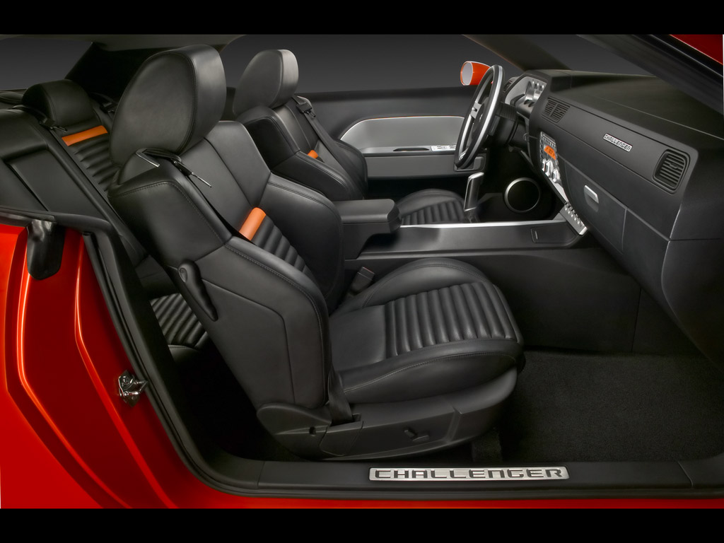
In contrast to the bright Orange Pearl exterior, the interior is a
no-nonsense, “let’s-get-in-and-go” black relieved by satin silver
accents and narrow orange bands on the seat backs. “Though the 1970
model was looked to for inspiration, we wanted to capture the memory
of that car, but expressed in more contemporary surfaces, materials
and textures,” said Alan Barrington, principal interior designer. As
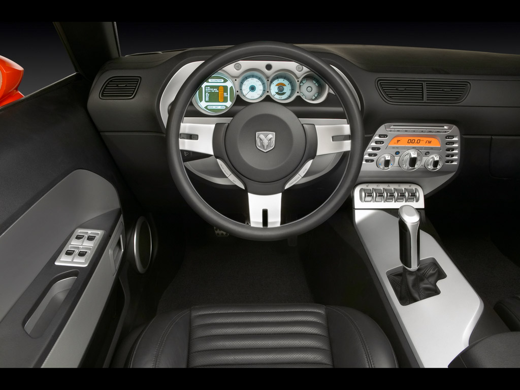
with the original car, the instrumental panel pad sits high,
intersected on the driver’s side by a sculpted trapezoidal cluster
containing three circular in-line analog gauge openings.
“We designed the in-your-face gauge holes to appear as if you are
looking down into the engine cylinders with the head off,” relates
Barrington. These are flanked outboard by a larger circular “gauge”
that is actually a computer, allowing the driver to determine top
overall speed, quarter-mile time and speed, and top speed for each
of the gears.
With its thick, easy-grip rim, circular hub and pierced silver
spokes, the leather-wrapped steering wheel evokes the original car’s
“Tuff” wheel, as does the steering column “ribbing.” The floor
console, its center surface tipped toward the driver, is fitted with
a proper “pistol grip” shifter shaped just right to master the
quick, crisp shifts possible with the six-speed manual “tranny.”
Inasmuch as the original Challenger was the first car to have
injection-molded door trim panels (now common practice), the doors
received special attention.
“We imagined that the door panel was a billet of aluminum covered
with a dark rubberized material,” Barrington relates. “Then we cut
into it to create a silver trapezoidal cove for the armrest.”
Although the flat-section bucket seats of the original Challenger
didn’t offer much support for aggressive driving, the front seats in
the Challenger concept car boast hefty bolsters much like those
found on Dodge’s famed SRT series cars. The trim covers’ horizontal
pleats or “fales” provide just a hint of that “70’s” look.
Rethought, reworked, reproportioned and redesigned, the Challenger
concept car offers iconic a HEMI-powered performance coupe derived
from a classic American muscle car.


